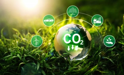
Το WEF σχολιάζει πως απαιτείται ταχεία πρόοδος προς την κατεύθυνση της καθαρής ενέργειας για να επιτευχθεί ο παγκόσμιος στόχος και να περιοριστεί το φαινόμενο του θερμοκηπίου
Τα δέκα διαγράμματα που δείχνουν την πρόοδο των χωρών στην «πράσινη» ενέργεια παραθέτει το Παγκόσμιο Οικονομικό Φόρουμ (World Economic Forum, WEF), στην έκθεση «Energy Revolution Global Outlook».
Το WEF σχολιάζει πως απαιτείται ταχεία πρόοδος προς την κατεύθυνση της καθαρής ενέργειας για να επιτευχθεί ο παγκόσμιος στόχος και να περιοριστεί το φαινόμενο του θερμοκηπίου.
Το Φόρουμ ξεχωρίζει 25 χώρες που έχουν επιτύχει εν μέρει στους στόχους.
«Ένας από τους κύριους παράγοντες για τον καθαρισμό των συστημάτων ενέργειας σε όλο τον κόσμο είναι η αύξηση των ανανεώσιμων πηγών ενέργειας.
Σε απόλυτες τιμές, η Κίνα είναι ο ξεκάθαρος ηγέτης, διαθέτοντας το ένα τρίτο της εγκατεστημένης χωρητικότητας αιολικής ενέργειας και το ένα τρίτο της εγκατεστημένης ηλιακής ενέργειας.
Ωστόσο, ανά άτομο, η Δανία διαθέτει την περισσότερη αιολική ενέργεια. (…)
Η καθαρή ηλεκτρική ενέργεια θα μπορούσε να κινηθεί πέρα από σπίτια, γραφεία και να τροφοδοτήσει τον τρόπο που κινούμαστε.
Οι τιμές για τα ηλεκτρικά οχήματα υποχωρούν γρήγορα και αρκετές χώρες νομοθετούν τώρα για την κατάργηση του κινητήρα εσωτερικής καύσης τις επόμενες δεκαετίες», σχολιάζεται μεταξύ άλλων.
Κι επειδή μία εικόνα ισούται με χίλιες λέξεις, αναλυτικά τα διαγράμματα:


Πηγή:www.bankingnews.gr
www.worldenergynews.gr
Το WEF σχολιάζει πως απαιτείται ταχεία πρόοδος προς την κατεύθυνση της καθαρής ενέργειας για να επιτευχθεί ο παγκόσμιος στόχος και να περιοριστεί το φαινόμενο του θερμοκηπίου.
Το Φόρουμ ξεχωρίζει 25 χώρες που έχουν επιτύχει εν μέρει στους στόχους.
«Ένας από τους κύριους παράγοντες για τον καθαρισμό των συστημάτων ενέργειας σε όλο τον κόσμο είναι η αύξηση των ανανεώσιμων πηγών ενέργειας.
Σε απόλυτες τιμές, η Κίνα είναι ο ξεκάθαρος ηγέτης, διαθέτοντας το ένα τρίτο της εγκατεστημένης χωρητικότητας αιολικής ενέργειας και το ένα τρίτο της εγκατεστημένης ηλιακής ενέργειας.
Ωστόσο, ανά άτομο, η Δανία διαθέτει την περισσότερη αιολική ενέργεια. (…)
Η καθαρή ηλεκτρική ενέργεια θα μπορούσε να κινηθεί πέρα από σπίτια, γραφεία και να τροφοδοτήσει τον τρόπο που κινούμαστε.
Οι τιμές για τα ηλεκτρικά οχήματα υποχωρούν γρήγορα και αρκετές χώρες νομοθετούν τώρα για την κατάργηση του κινητήρα εσωτερικής καύσης τις επόμενες δεκαετίες», σχολιάζεται μεταξύ άλλων.
Κι επειδή μία εικόνα ισούται με χίλιες λέξεις, αναλυτικά τα διαγράμματα:
Πηγή:www.bankingnews.gr
www.worldenergynews.gr